🪴 Pauloriculture
Search
[Dune] NFT Market Overview Chart Review (EN)
# Market Overview Chart Review
Date : March 22, 2023
Reviewed NFT Market Overview
# 1. Overview
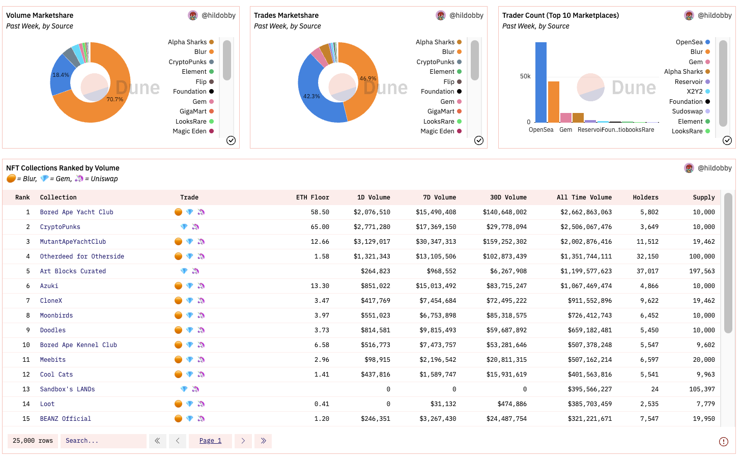
You can see that we have constructed a pie chart using Volume / Number of trades / Number of traders.
Given that the amount of data is large by default, and that more recent data is more meaningful for trading, they show the most recent 1-week data. The trade column in the NFT Collection Ranked by Volume chart below are links to actual tradeable websites, so they don’t mean much.
# 2. Volume
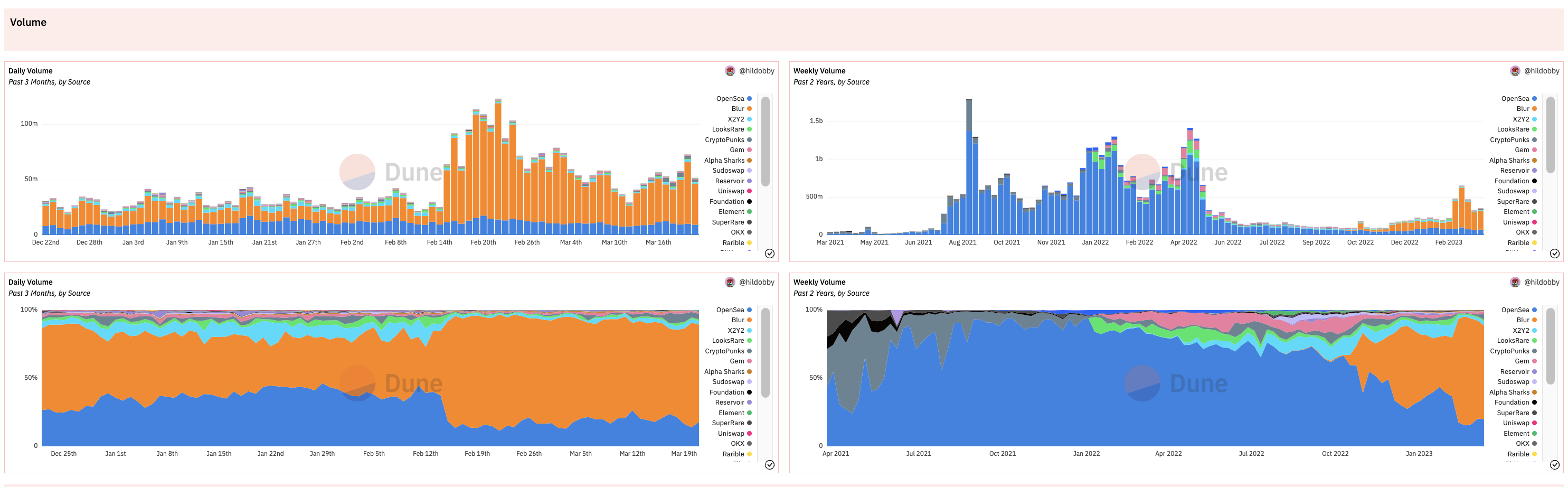
Trading volume is organized into Bar Chart and Stacked Area Chart, each of which allows you to view Daily Volume and Weekly Volume.
The Bar Chart is a great way to see total volume, so you can see overall volume trends and time series of marketplace share. The Stacked Area Chart is an intuitive representation of the share seen in this Bar Chart.
# 3. Transactions
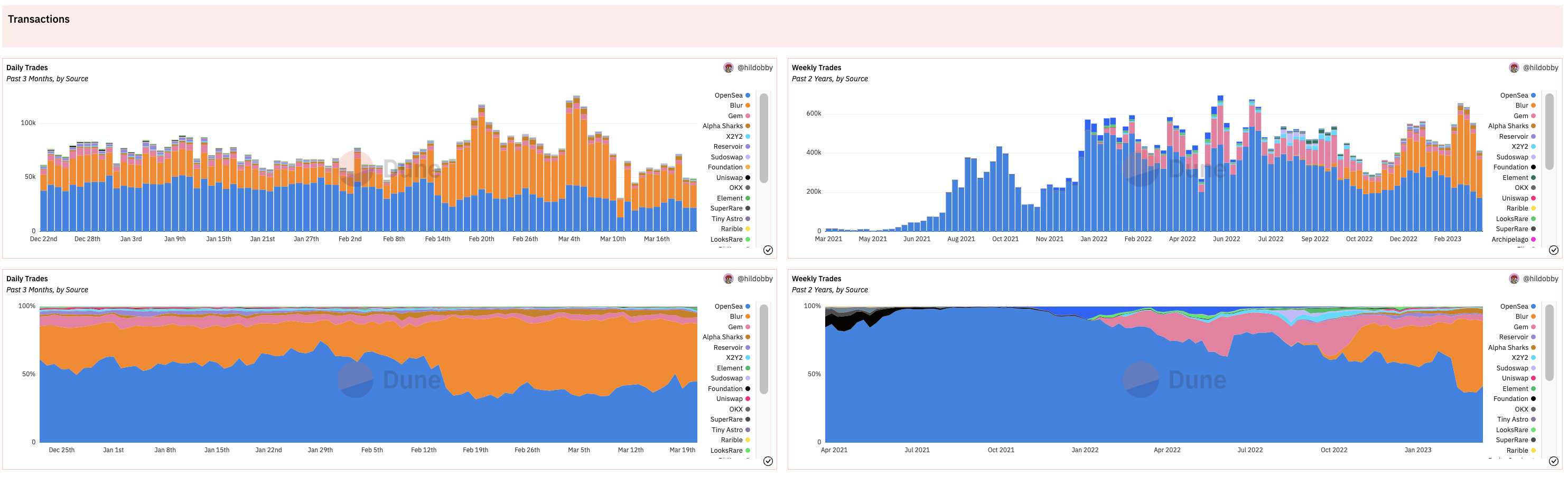
The transactions chart is organized the same as the volume chart, with the numbers in each chart representing the number of transactions.
If you compare the number of trades chart to the volume chart, you can see that Blur’s volume has recently spiked and surpassed Opensea’s volume, but that hasn’t translated to the number of trades. We can assume that there are still a lot of active users on Opensea.
# 4. Traders
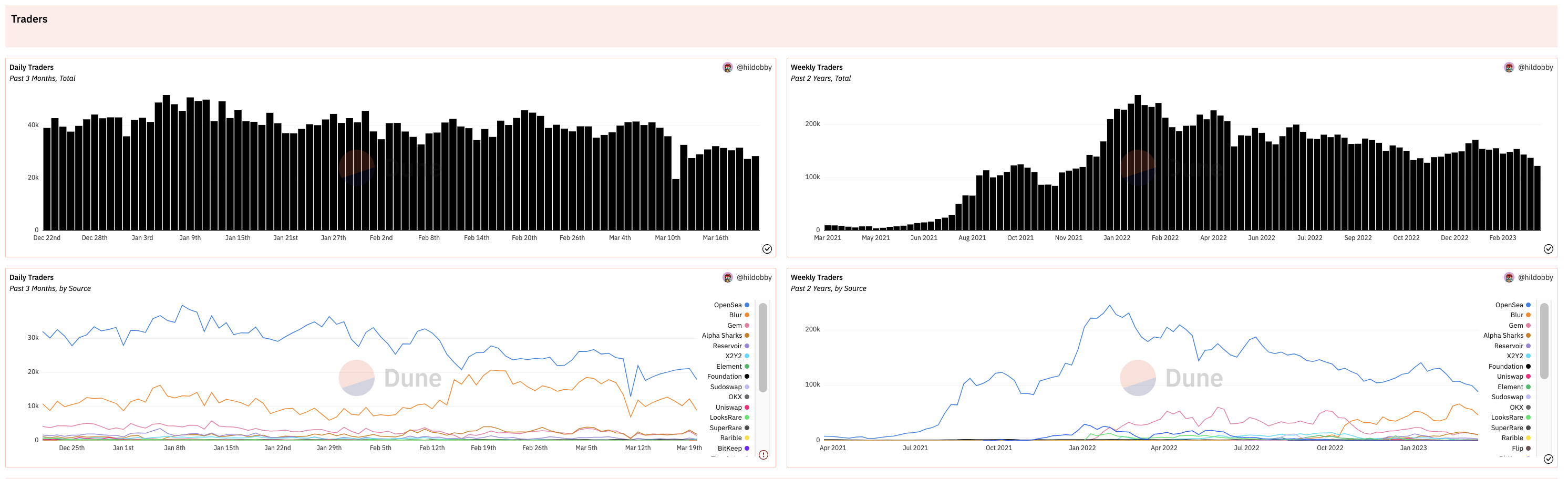
This chart shows the number of wallets that have traded NFTs.
In this case, They used a Line Chart instead of a Stacked Area Chart. I thought it’s better to use a Stacked Area Chart, so I made Stacked Area Chart for comparison
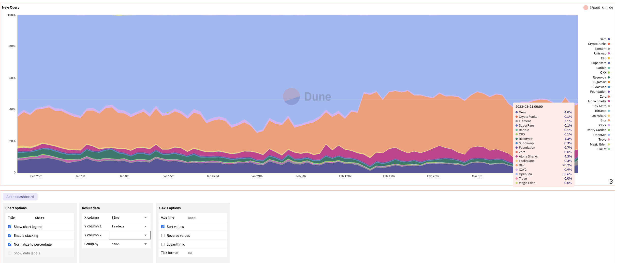
I was able to see these results, and there are a few takeaways from this comparison.
- Stacked Area Chart has the advantage of visualizing occupancy rates.
- Line charts allow you to visualize the share, but also to see how the value changes over time. For example, you can observe a sharp drop in the number of traders in March.
- However, the Traders chart is different from the other charts in that the Bar Chart counts the number of trading wallets by date, while the Line Chart counts the number of trading wallets by marketplace. Since there may be wallets that use multiple marketplaces at the same time, it is important to keep this in mind when organizing the chart.
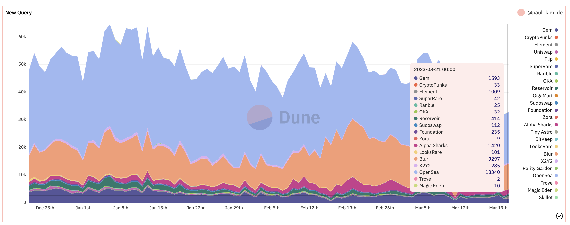 If you compare the screenshot above with the Bar Chart in the Dashboard, you can see that the values on the y-axis are different.
# 5. Token Standards
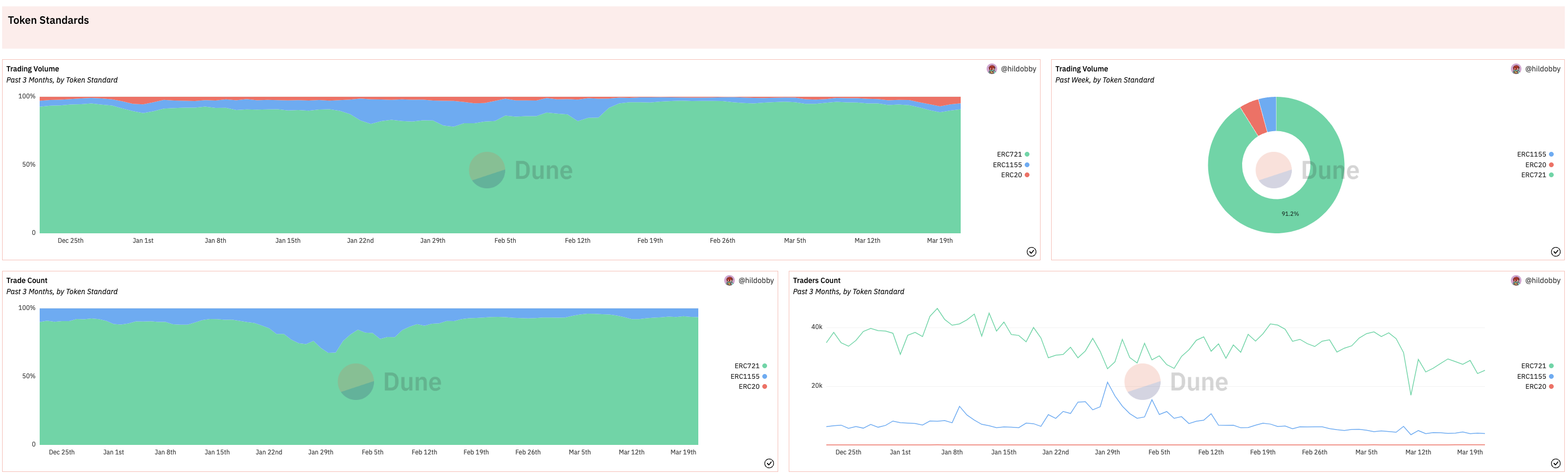
These Charts show Volume, Trade Count, and Trader Count by Token Standard.
This is where the question arose. In the case of ERC721, you can only trade one token per token id, whereas ERC1155 allows you to trade multiple. Also, Opensea allows bundle trade, so I was wondering how to calculate the price of nfts in these situation.
So I looked into Dune Spellbook.
링크
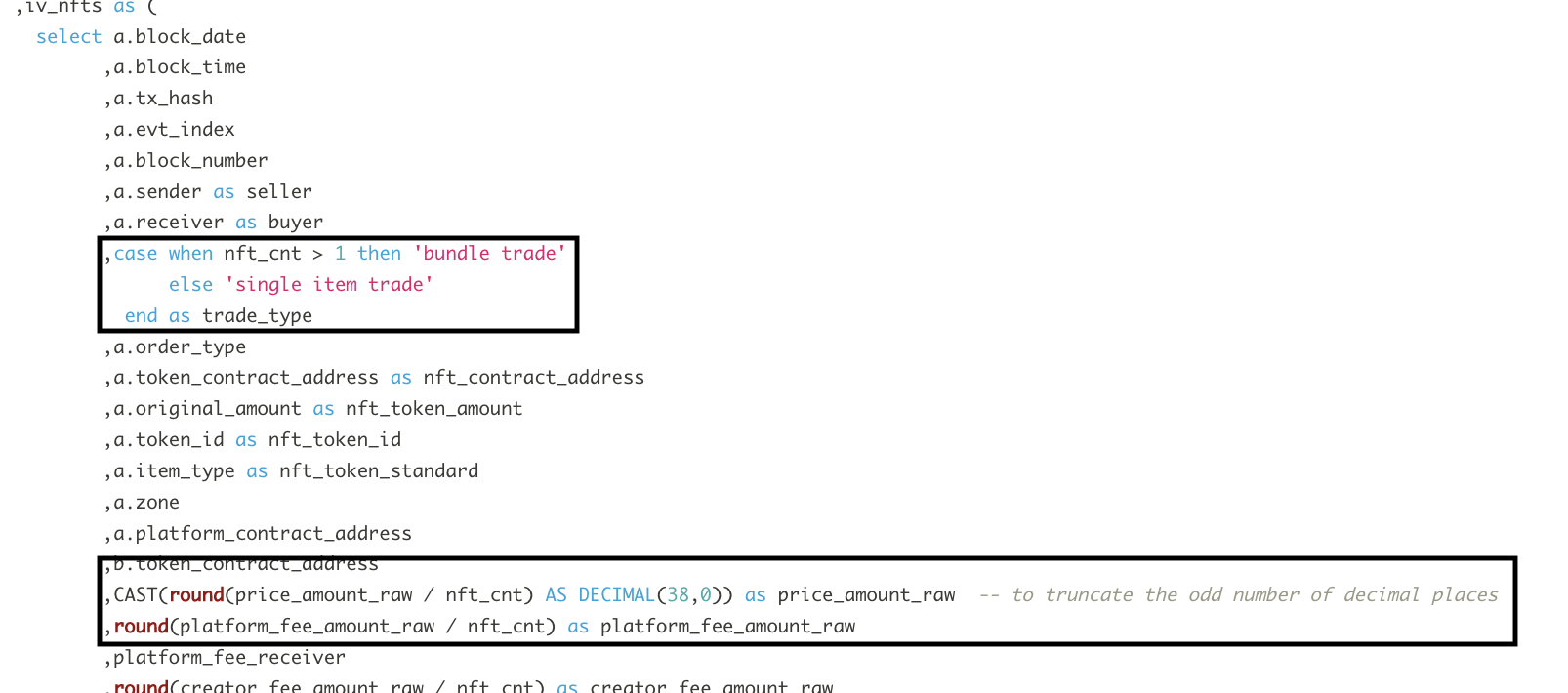
As you can see in the screenshot above, if multiple NFTs were traded in a particular trade, we were able to categorize it as a bundle trade and then split the trade price equally. This tells us the following:
- The opensea trades included in the nft trades dataset used by Dune are calculated by dividing the total price of the individual purchases of nft in a trade by the number of nft in the trade.
- As a result, some transaction value data was calculated incorrectly.
- However, in bundle transactions, the seller estimates the individual prices of the NFTs in the bundle and sells them together, and the same applies to the buyer, so there is no problem with using this data unless there is an accounting requirement for both the seller and buyer.
# Further Study
While researching Spellbook, something occurred to me that I wanted to investigate further. I’ve seen that it’s difficult to estimate the exact purchase price for bundle transactions on Opensea. I want to see how Dune Analytics estimate the purchase price for transactions from market aggregators like Gem and Blur that sweep listings from multiple marketplaces